Leaflet Data Visualization Strategies - Markers, Marker Clusters, Heatmap, Hexbins
Contents

Leaflet Data Visualization Strategies - Markers, Marker Clusters, Heatmap, Hexbins
The art of not displaying too much information
Whenever dealing with sophisticated data you need to think carefully about what you want to visualize. On a map you can easily be overwhelmed with too much information leading to orientation issues in the jungle of markers, background layers and legends.
It’s a true art to find a good balance between displaying the available, very fine-grained data (you really want to show to your readers ;) ) and the appropriate amount of information one can handle intuitively. It’s always tempting to think from a developer’s perspective and just do what is techinically possible. But that won’t be appropriate for most use cases. A simple example is markers on a map. A user doesn’t need 1 Million markers. Instead - not only for performance - it makes more sense to aggregate data and shrink yourself to what’s really your point. Why not either use a marker cluster (easiest way) or aggregate your data to a grid raster or regions and use a choropleth map instead?
Comparing different methods for the same data
Let’s use an easy social media related example for illustration purposes. We have 10.000 coordinates where each coordinate has two values, i.e. distinct users who posted something and the total post count per coordinate.
An example array could look like this [lat, long, users, posts]
| |
Markers
Using markers only we can plot:
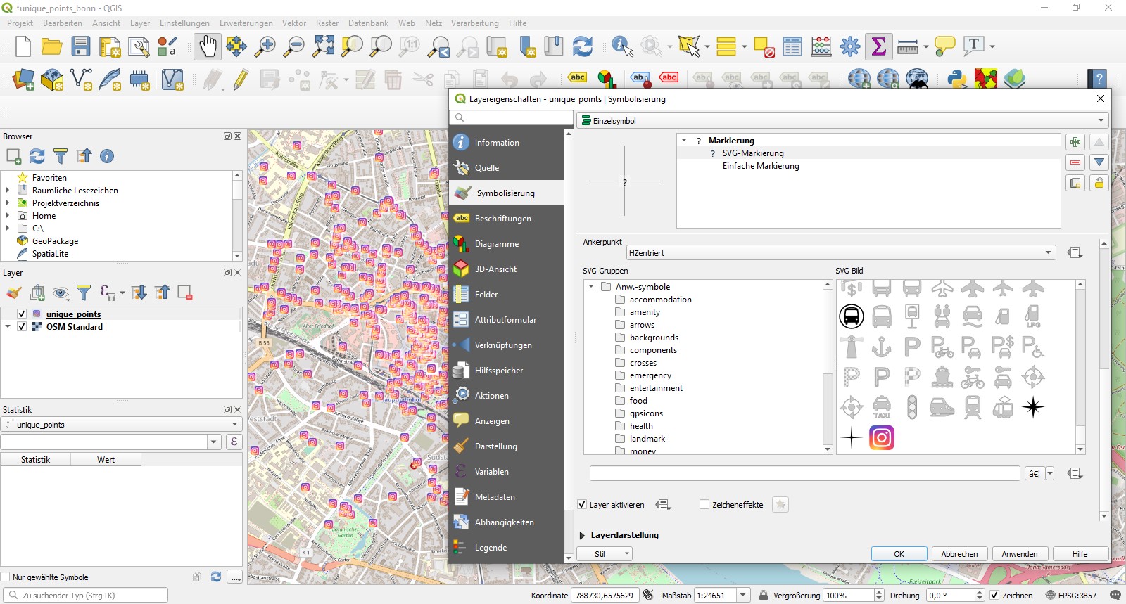
- Simple pin markers displaying the counts for users and posts. Check out how to use custom svg markers in QGIS.

- Circle markers instead of the classic marker pin and visualize one more value by setting the marker radius. I.e. one could use user count, post count or even calculate an index like posts per user.
- Circle markers with a custom radius and fill color to visualize two values, i.e. user count as radius and post count as color range.
The latter is the more sophisticated and has most visualization power but quickly get’s overwhelming. Also with some leaflet plugins different zoom levels don’t always look the way you would like them too and require some time efficient fine tuning. One can imagine, that a million markers with different size and colors won’t look nice.
Aggregates
With aggregated counts instead, one can gain control over big data.
The most simple way is to use leaflet marker cluster, probably one of the most used plugins for leaflet. Unfortunately this corresponds to our first method from above as we can’t visualized any value but just the sheer coordinate itself and coordinate counts, respectively the aggregated coordinates for a certain area.
A more sophisticated approach is leaflet heat. It creates a simple heatmap with a color range for every marker but with a fixed radius. One can either decide whether the coordinate count is sufficient or user count, post count or an index should be used as a color base. It already produces nice results and can be intuitively interpreted. The darker the colors the higher the value.
Unfortunately until today (02/2021) no one implemented the option yet to set different radiuses. So one is caught in a fixed heat radius around a base point.
Leaflet Hexbins - Easily visualizing two independant values with hexbins
And this is where leaflet hexbins come into play! The principle is similar to leaflet heat: based on coordinate aggregates hexagonal bins are drawn on a map using d3 library. One can easily switch between different scenarios:
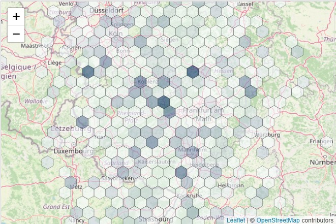
- Fixed hexbin radius and a color based on either coordinate count within bin, or an aggregated value, such as sum of user count or post count. This use case is similar to leaflet heat.
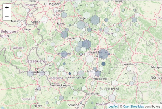
- Hexbin radius as user count, color range as post count or vice versa
Hexbins does three things for you: aggregating, calculating the aggregated values for user count & post count and finally drawing everything nicely also for different zoom levels. In the hexbins examples there is yet no example provided describing our use case. However one figures out, how hexbins work it’s easy to implement.
Assuming the sample array from above, the crucial part of the code looks this this:
| |
The radiusRange can be altered to fit the bins to your needs. In this case hexbins can overlap.
The ever lasting misery of lat long
One last thing: leaflet hexbin wants long lat format, so if needed simply remap the array with
| |
Altogether it looks like this for some sample data. Find the jsfiddle here.

The less complex version with fixed radius looks like this. jsfiddle
